Grid-based web design is another type of web designing that is becoming popular in the modern web design. The grid is a series of intersecting horizontal and vertical lines spaced at regular intervals. As an established tool in web design, grids act as a guide in placing the elements in a design to look clean, highly readable, scannable, and navigate-able for your visitors. It gives both visual structure for laying out site elements and a framework for its content.
Here is another web design inspiration for you to give you an idea on how to use grid effectively to build websites. Check out these Incredibly Simple and Organized Grid Layout Websites. Enjoy!
Anderson de Paulo

The design of the website has a layout style of grid. Anderson de Paulo is a freelance art director and digital designer.
View Source
Bleep
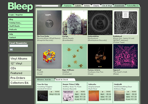
Another well-designed grid layout website. Bleep.com is the highly successful online music store focusing on the independent music sector.
View Source
I am Shimone Samuel
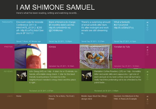
Another grid-based website.
View Source
42 Angels

Another website which has a nice grid design on which the interaction is also great. 42Angels.com is a community for Czech and Slovak entrepreneurs with a passion for start-ups, providing angel/seed stage financing with added value.
View Source
Rich Brown

An attractive, grid-based blog of Rich Brown. Rich Brown is a freelance interaction designer, digital creative & front-end developer.
View Source
Sylvain Toulouse
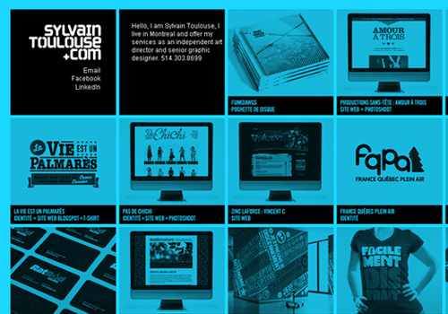
A great looking portfolio of grid style that changes color every time you refresh the page. sylvain Toulouse is an independent art director and senior graphic designer.
View Source
Wolff Olins

A nice looking grid at work along with WordPress. Wolff Olins is a brand consultancy business for the future.
View Source
Kane Constructions
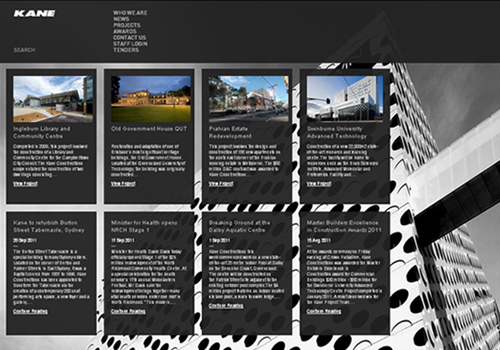
A website which features a comprehensive grid based layout. Kane Constructions is a privately owned commercial construction company that has earned a strong reputation for its innovative approach and quality delivery to clients.
View Source
Dynam It

Another website which applies the dynamic grid-systems. DynamIt is a Columbus, Ohio based web engineering, design and development firm focused on creating usable, efficent websites and web applications.
View Source
Major Tom

A website built with grid-based design. Major Tom is a leading music agency who specializes in recording, publishing, music supervision and soundtrack composition for commercials, TV and film.
View Source
OMG! from Yahoo!

A website which has a grid or column based layout. OMG! from Yahoo! is a celebrity news and gossip website where you can get your daily celebrity gossip, news, photos, videos, and more.
View Source
The Awesomer
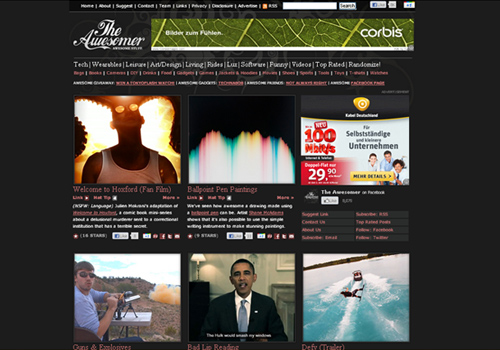
Uses a grid style to organize its website. The Awesomer is a repository of awesome products such as gadgets, fast cars, funny videos, fashion, movies, games and other awesome things.
View Source
Velhetica
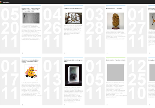
Another website with a grid-based approach. Velhetica is a hyper-stoked, internet-addicted, marathon running good-time having food-eating opinionated, shithead Art Director.
View Source
Viktoria Klein
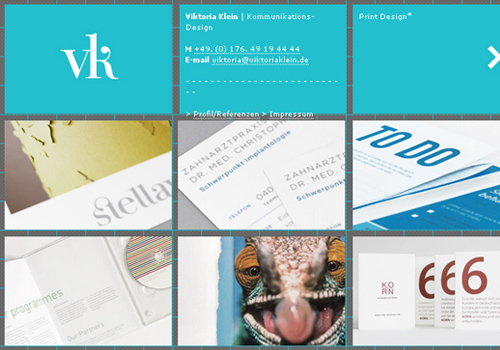
A website with a clean and blue grid style. Victoria Klein is a Russian born freelance writer, photographer, and creative dabbler.
View Source
Popa

A grid-based design website in which the content is “packed” in boxes. POPA – the big red button for your iPhone camera!
View Source
Simon Collison
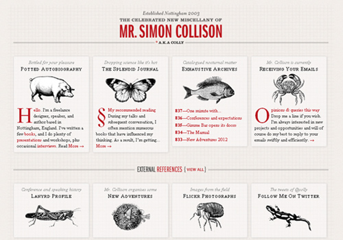
A website which utilizes traditional grid structures. Simon Collison is a UK-based web designer, developer, author and speaker.
View Source
Elliot Lepers

This website uses an interesting grid layout with interactive sliding boxes.
View Source
Beat Port

Have a scale-9 grids for skins using CSS Design View. Beatport is the world’s largest dance music community specializing in electronic dance music and culture.
View Source
Not Cot
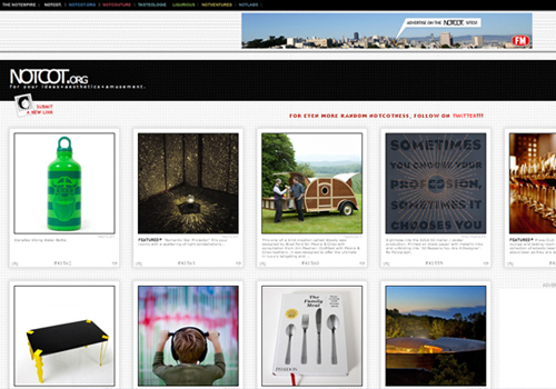
NOTCOT.ORG is a website that has a nice grid and new editorial look.
View Source
Peter Jaworowski
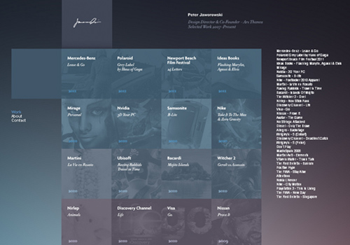
A website which showing some modules in hierarchical grids. Peter Jaworowski is a professional graphics designer and illustrator based in Warsaw, Poland.
View Source
Craig & Karl
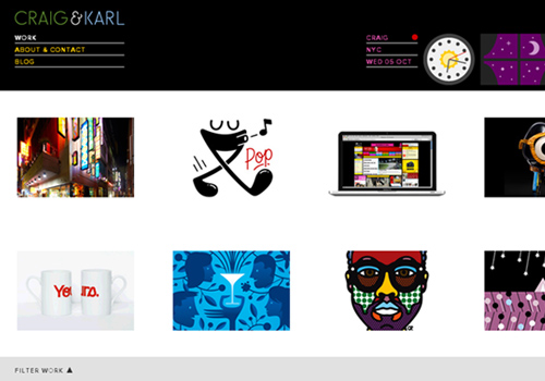
This website use the power of grid based designs. Craig Redman & Karl Maier live in New York and Sydney respectively who collaborated to produce art, illustration, design and typography.
View Source
Eric Steuten

Eric Steuten uses crop-shots to form the portfolio grid elements.
View Source
We Are Hunted
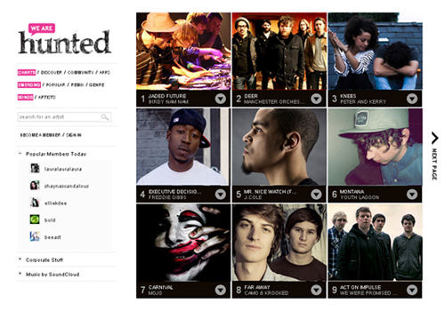
In this site, the album covers were displayed in grid. We Are Hunted is a music aggregation website that presents the hottest new music in the world today.
View Source
Photography Served
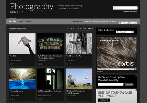
This is a grid-based website for photography.
View Source
Sunday Vision
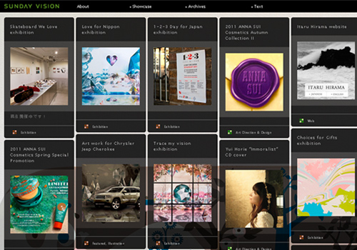
Sunday Vision is another good-looking grid-based website.
View Source
Creative Depart
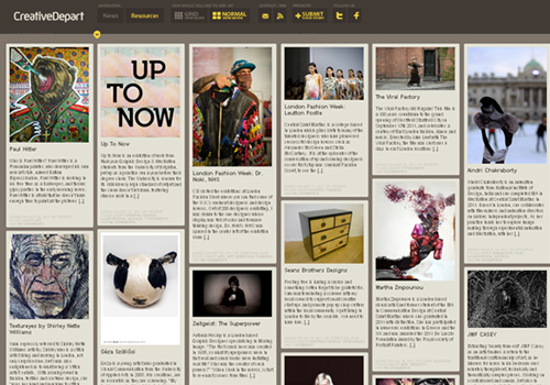
Another interesting & good-looking grid-based layout website. CreativeDepart is a premiere source for web-design inspiration and trends.
View Source
Toxic
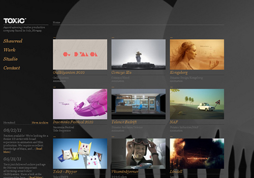
Toxic.no makes use of the grid system.
View Source
Rodgers Townsend
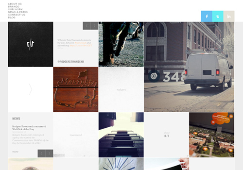
A nice and clean website using the grid based approach. Rodgers Townsend is a full-service advertising agency based in St. Louis, Missouri.
View Source
Middle Mojo
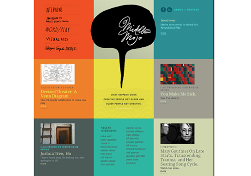
Middle Mojo uses a grid-based web design for CMS.
View Source
Album Art Collection
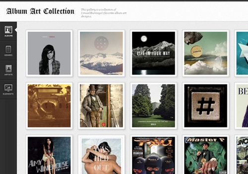
Album Art Collection has a nice and clean grid navigation layout.
View Source
30 Elm
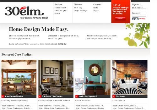
30elm has a clean grid-based design.
View Source


WONDERFUL Post.thanks for share..more wait .. ?